Guangtai Visual Identity Design
Redesign and modern expression of traditional corporate brand
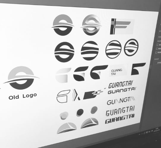

First Sketch
There were many elements about the old identity system that I wanted to somehow carry over in the rebranding.
My initial sketches reflected this desire to hold onto the old system.


Ideation
I soon realized that in order to help the client redesign successfully, I needed to start with a blank slate.
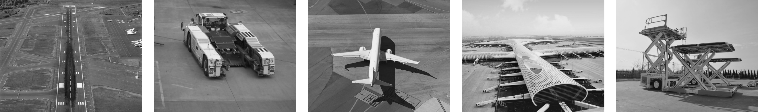
I explored a new way to express the symbol visually: I extracted the image about Guangtai and processed it with a square pixel, resulting in a series of abstract symbols.
Here are some symbols for each concept extracted from the pictures.
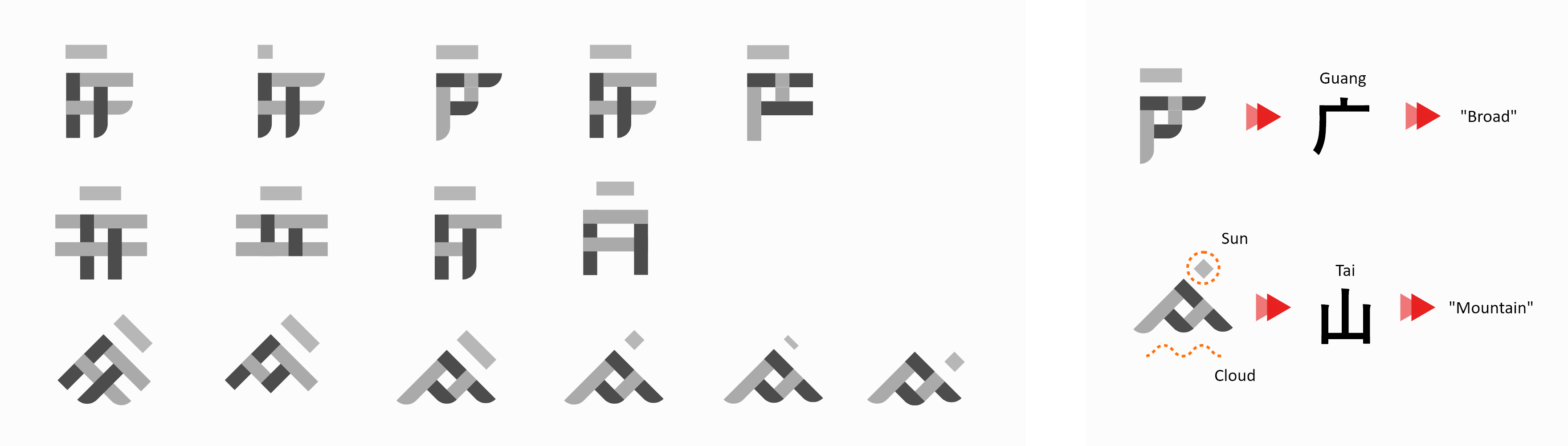

Iteration
Once I chose this design direction, I started a series of explorations to find the best one.
In the process, I realized that some symbols had special concepts that we wanted to express, which I extracted and expanded into the final logo.
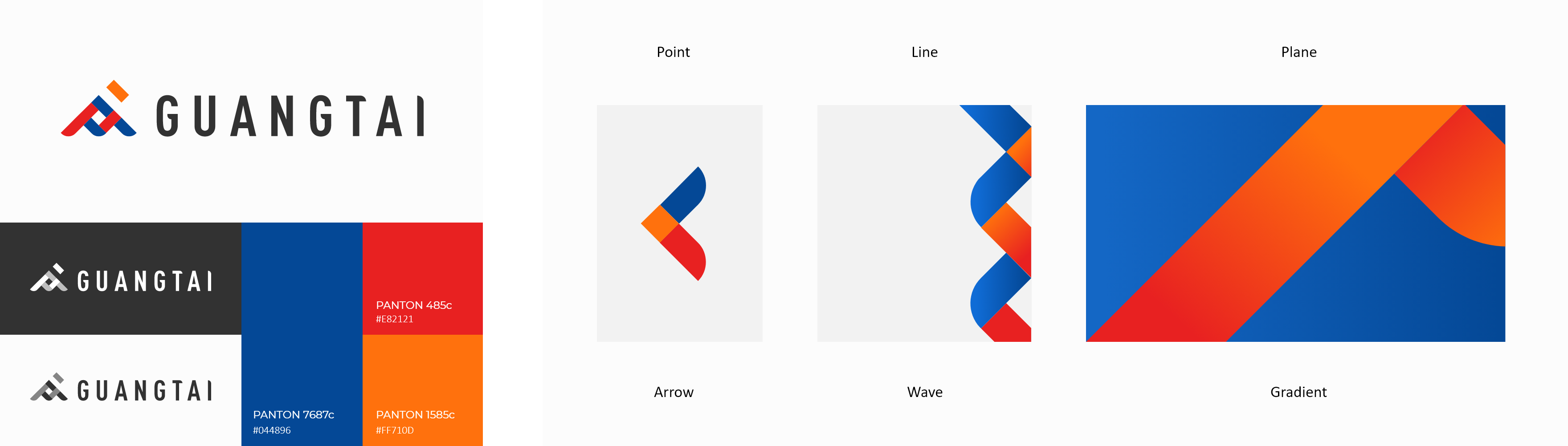

Build the system
Once the new logo was finalized, the next step was to create an identity system.
I deconstructed the logo mark into its core shapes: the point, line, and plane.
From those shapes, I derived a series of units that would serve as the building blocks of visual language.
Outcome


